Franchising Magazine JUL/AUG 2014

Art DirectionEditorial DesignGraphic Design

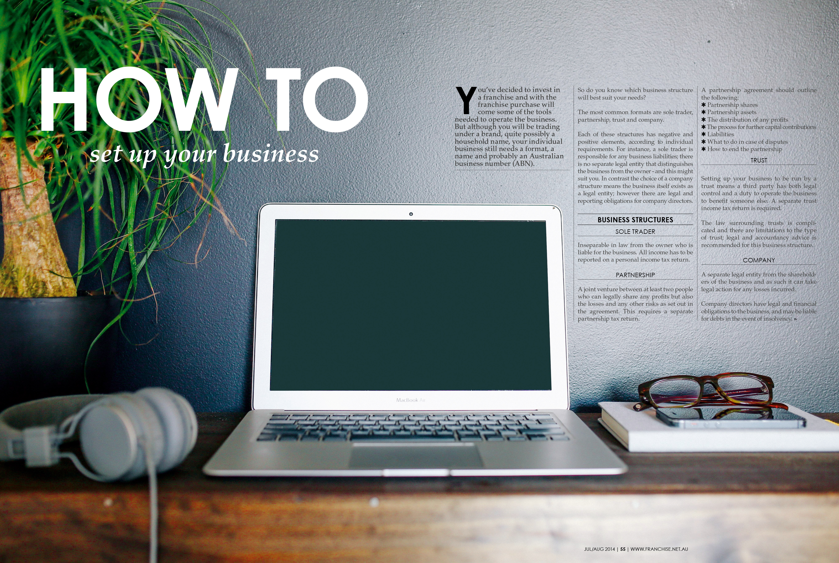
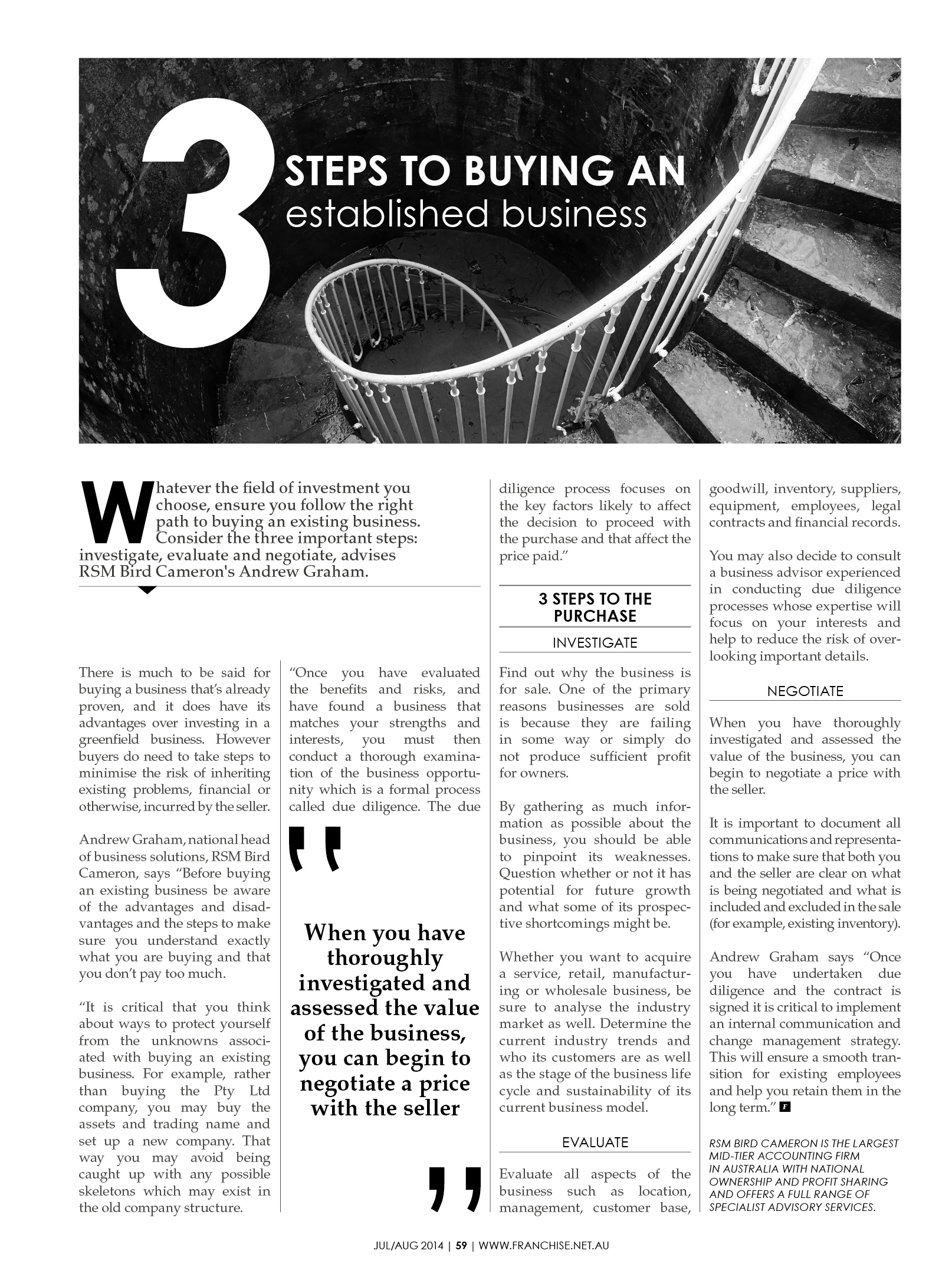
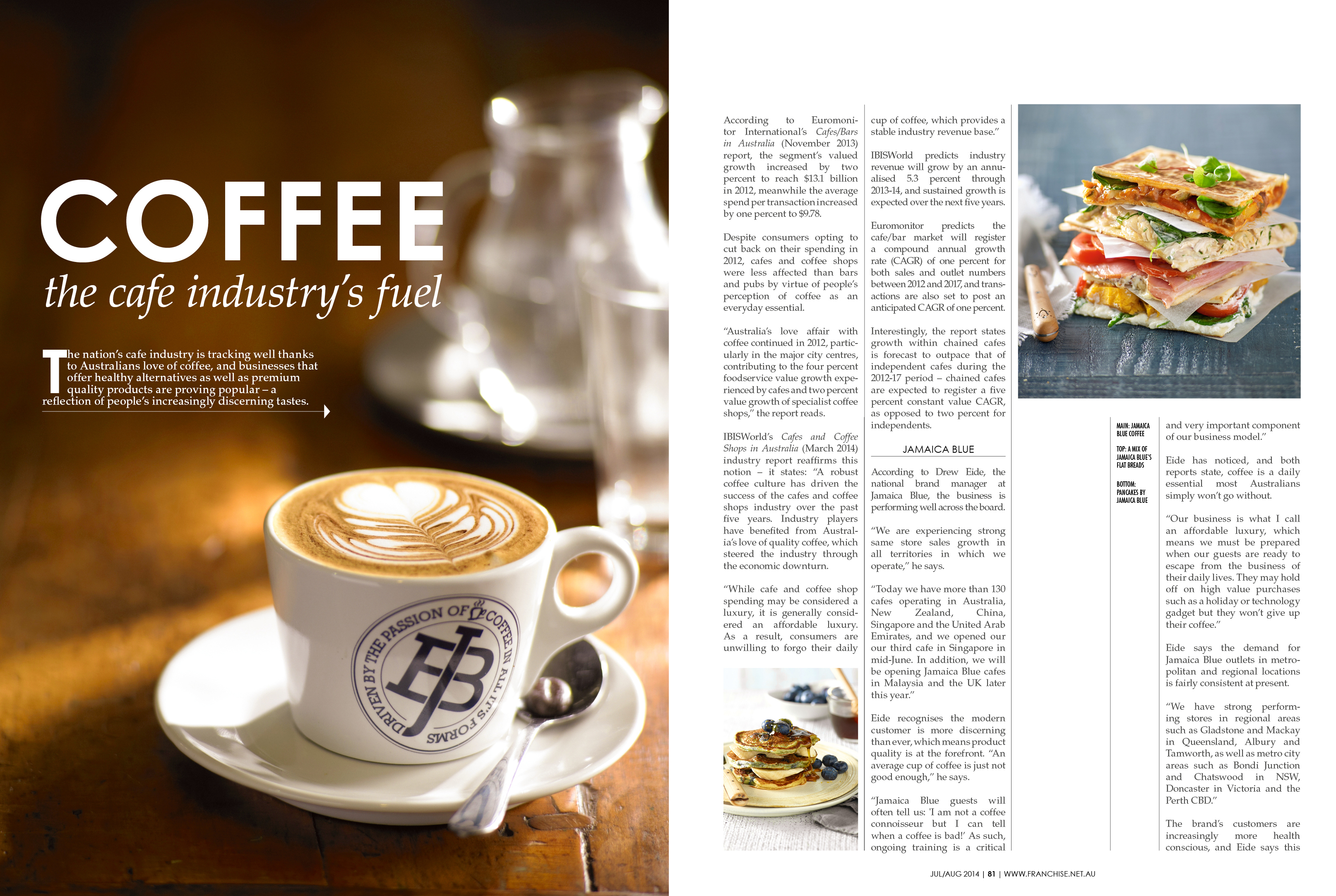
Say hello to the Franchising magazine refresh! With my colleague from creative, Michael Bevan, we worked together to create this new look for the magazine. As I was laying out over the past year I found that even though I simplified the styles down and tried to bring some order with consistency, I was constantly in a battle with the the numerous ads and our very own magazine colours. So in this new issue we toned it right back. To make it more friendly and professional at the same time. We gave it structure and authority with lines and monochromatic colour schemes. We separated ourselves from the ads and occasionally let the image colours do the talking. We now have something that the Franchising team is truly proud of and this will help us wipe the floor with the rest of the competition out there.

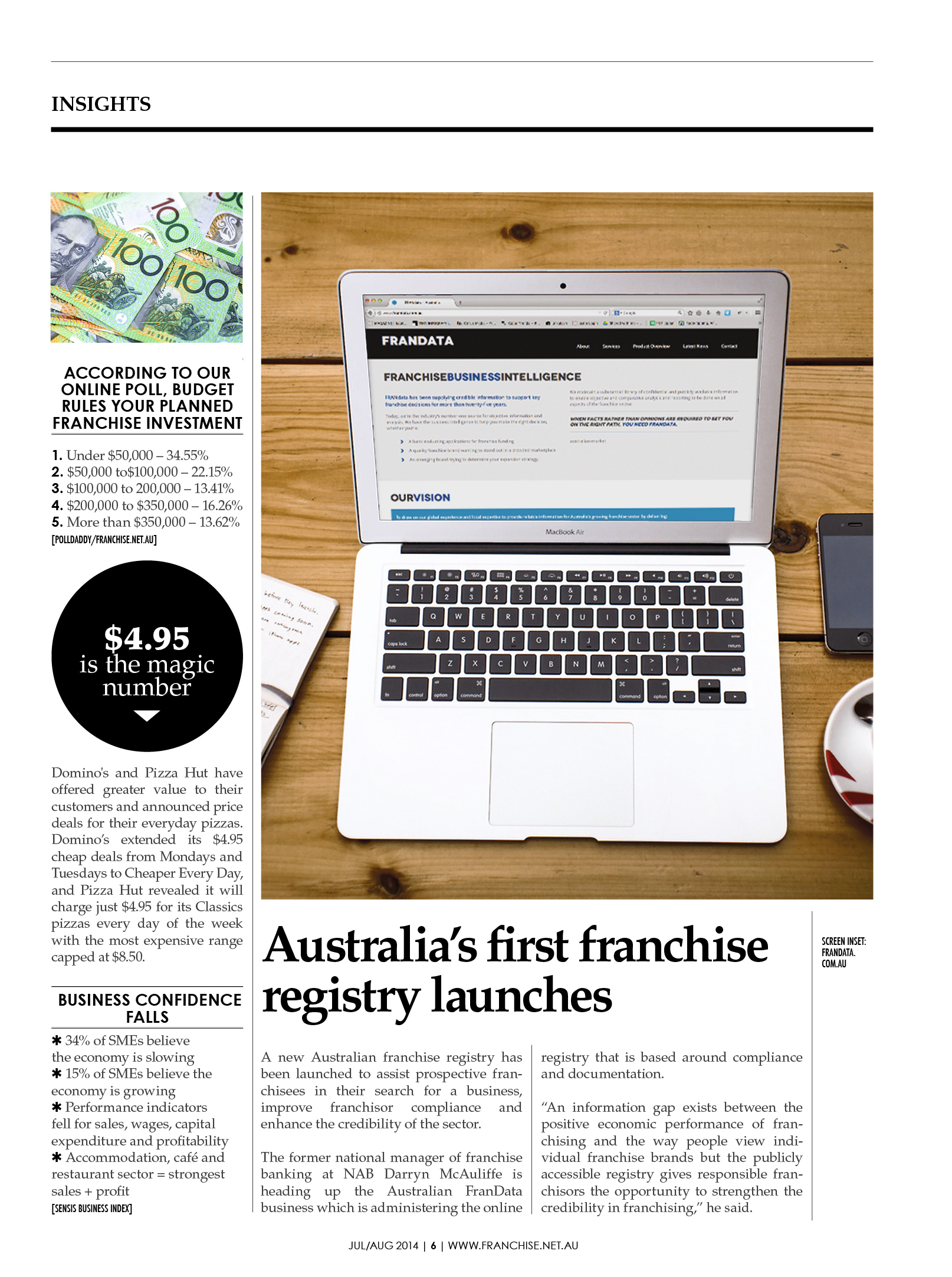
Check it out! The new cover design. We decided to make it a lot cleaner than before and get rid of the red colour from previous issues. I always felt it competed too much with the photo, especially when brands have their own colours.  Plus we pushed Franchising right to the top so that it will definately show at the news stand when mags are stacked in front.

Check out this issues supplement here: The Profiler
Check it out....new title. Art Director!
A more flowy news section
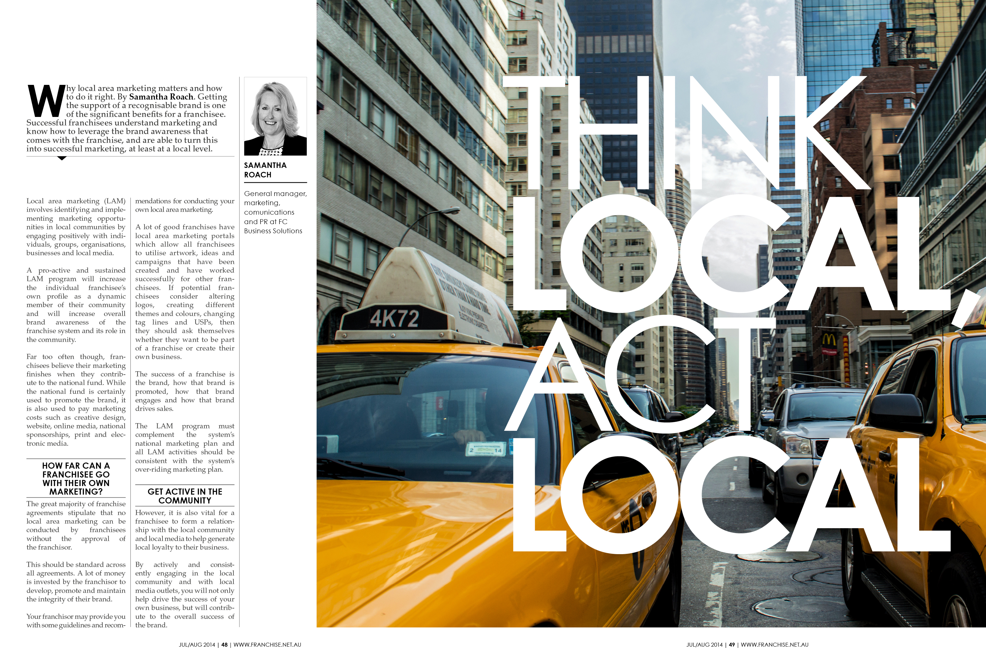
Before I always used to find I competed with advertisements for visual attention. But now I've gone for a monochromatic style when going up against them so we define their and our space. This way we both stand out on your own merit and instead complement each other.
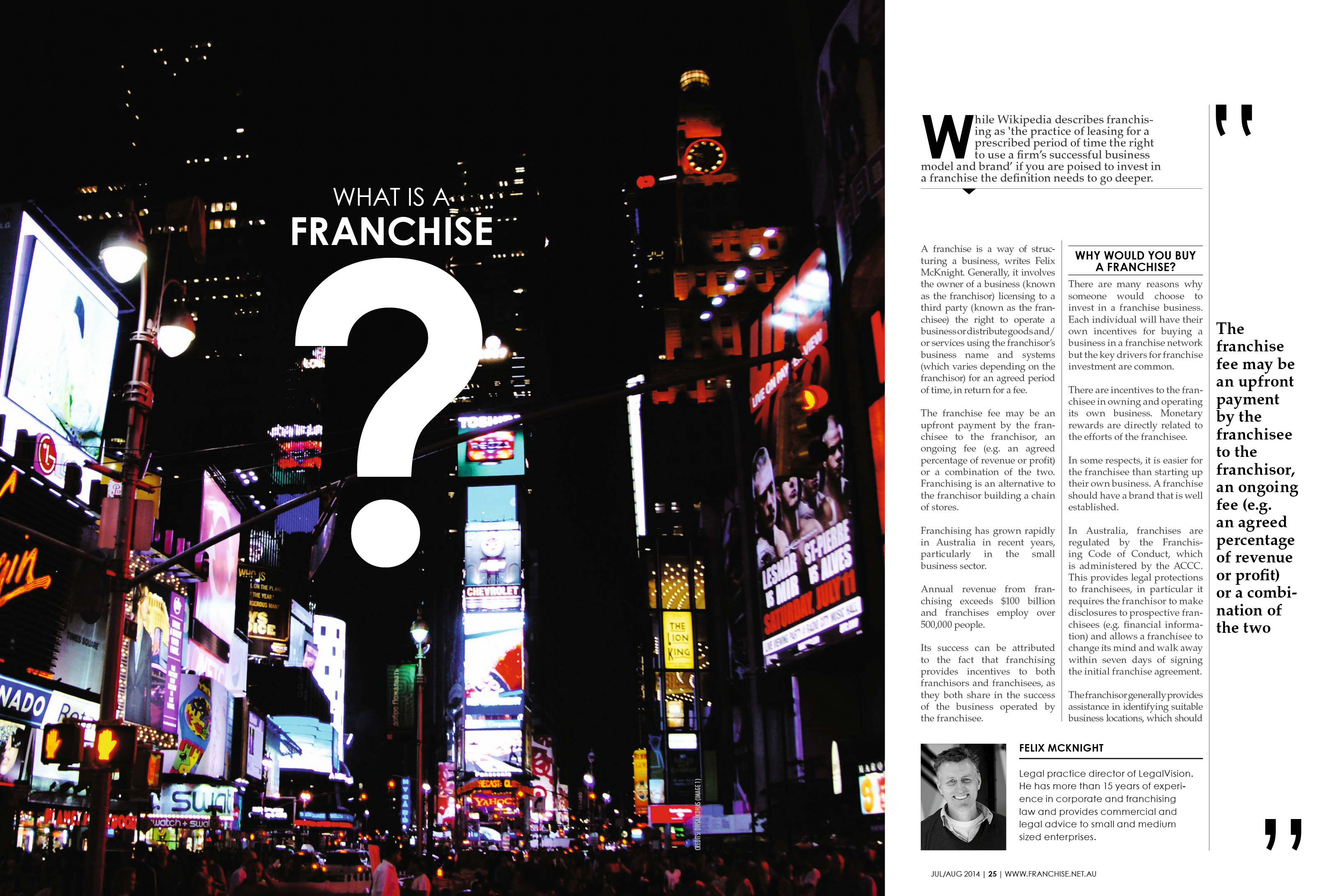
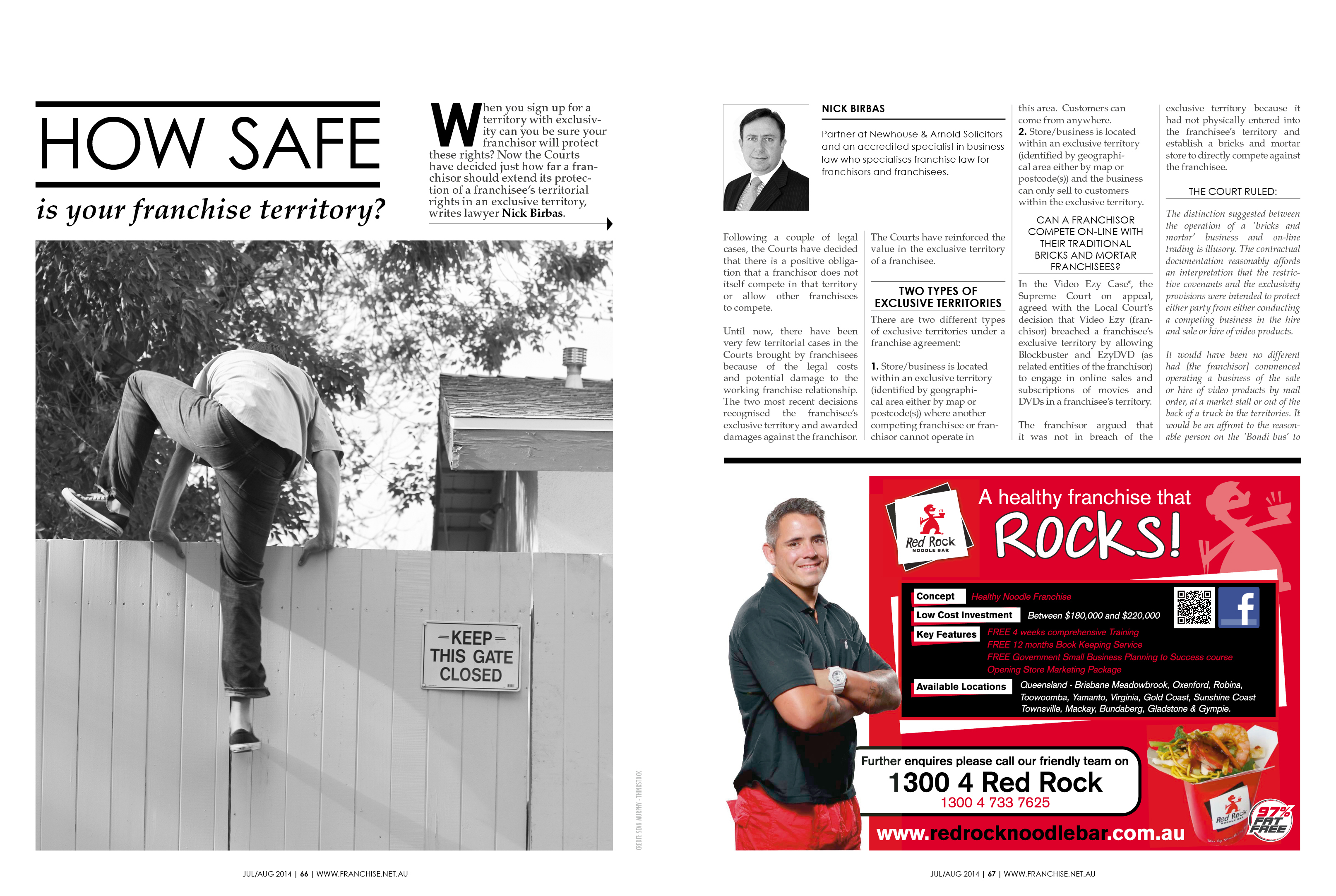
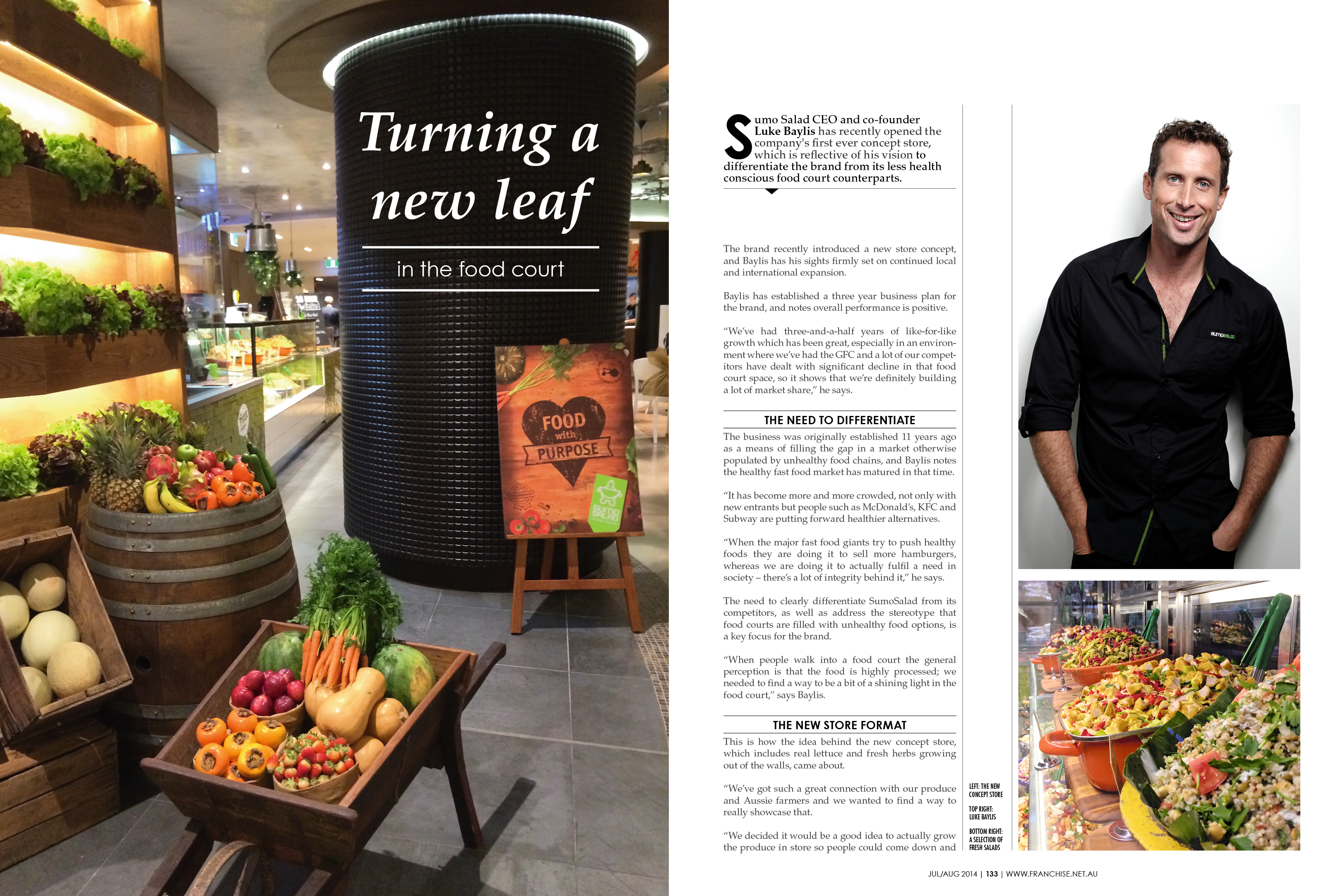
Love this spread sooooo much! The other thing we did this issue was to try to get away from literal stock imagery which tell the same story again. There's something so beautiful about how this photo just gives so much more intrigue to the story now. We've used these types of photography a bit through the mag couretsy of stock free imagery from Unsplash.com & Deathtothestockphoto.com
This spread for Noodlebox inspired me to use Box as a theme.
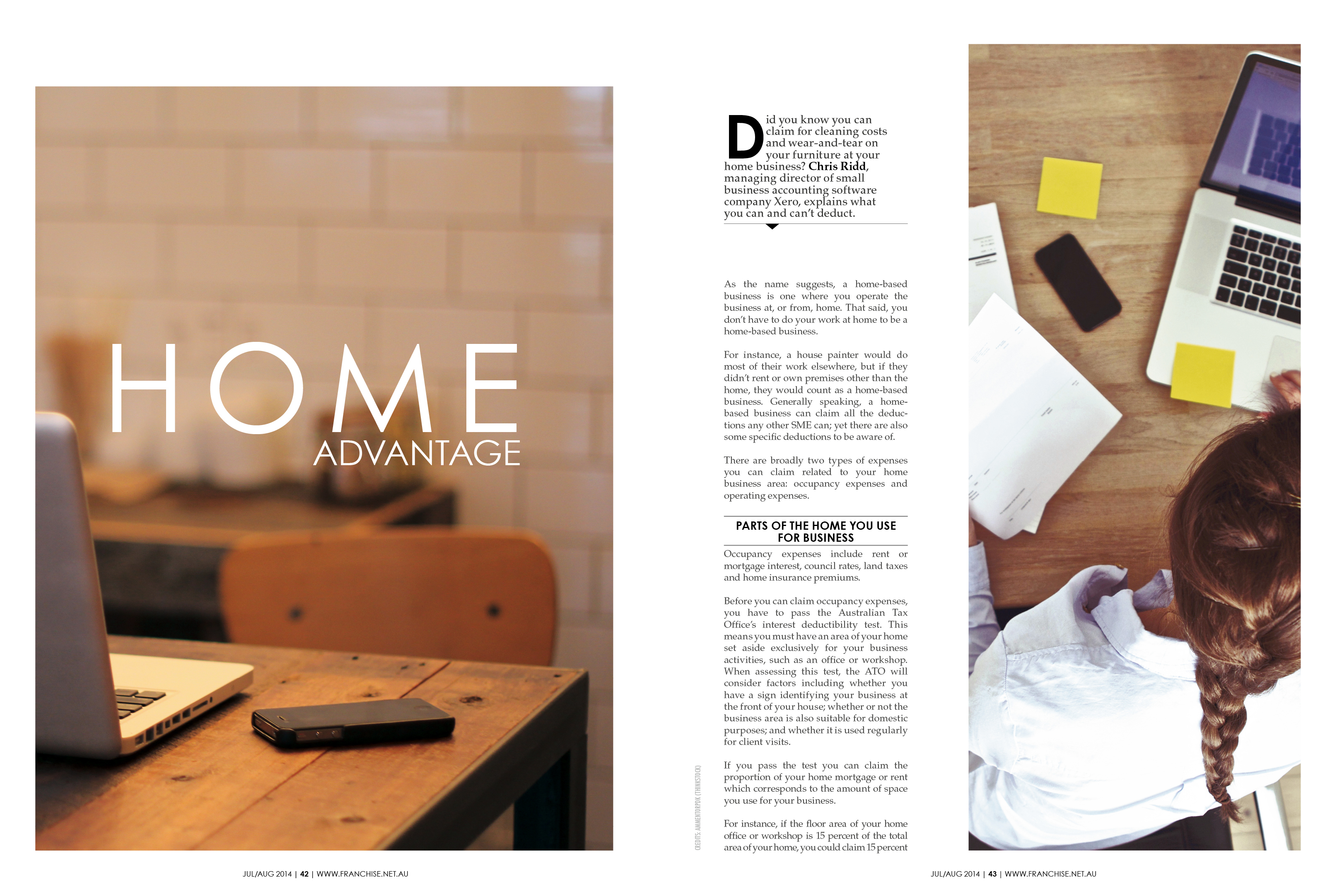
Again awesome use of the monochromatic against the ads.
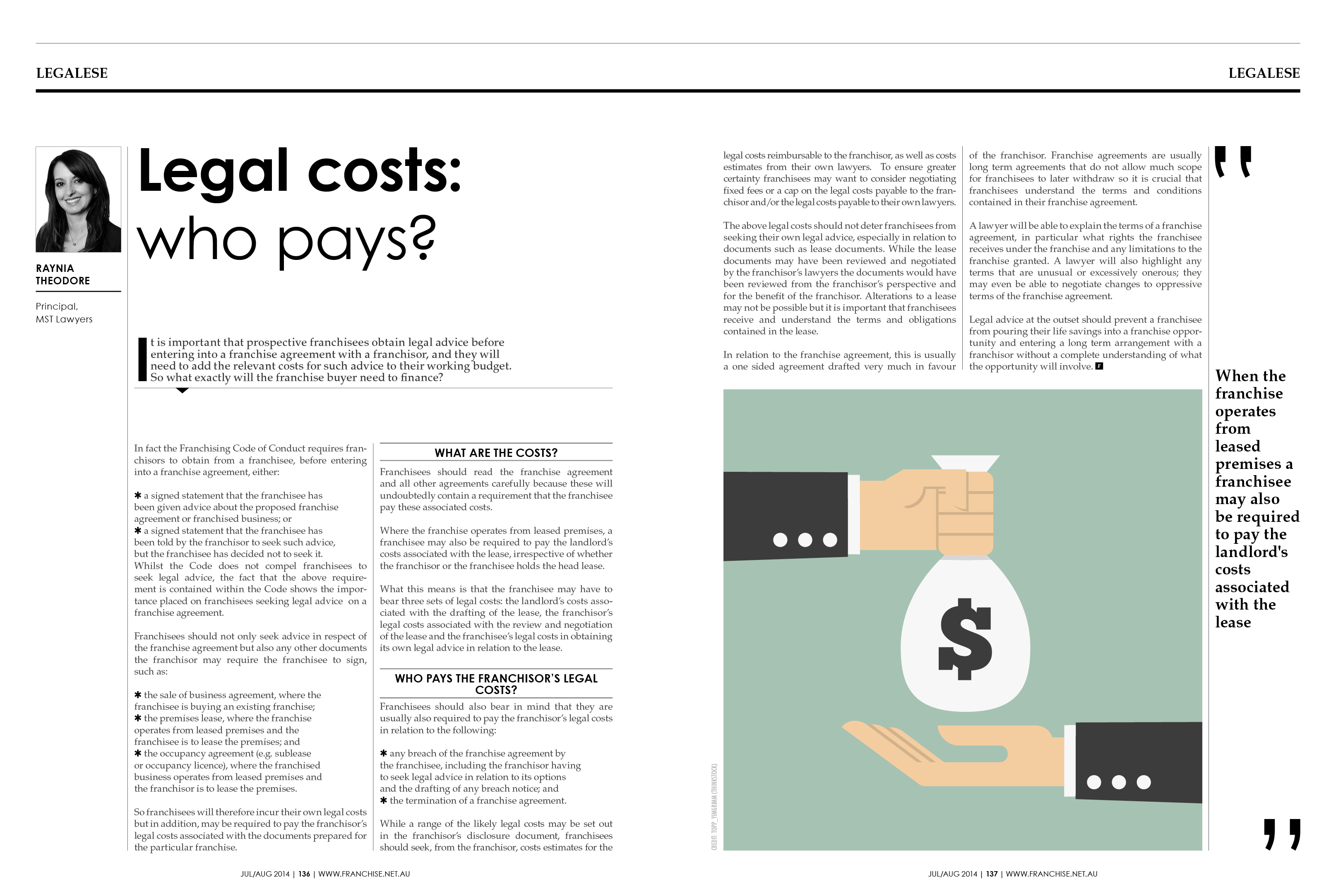
For our regular coloumns we decided we should go for a different look just to differentiate them from the rest of the features. This more newsy style gives it that much more authority.
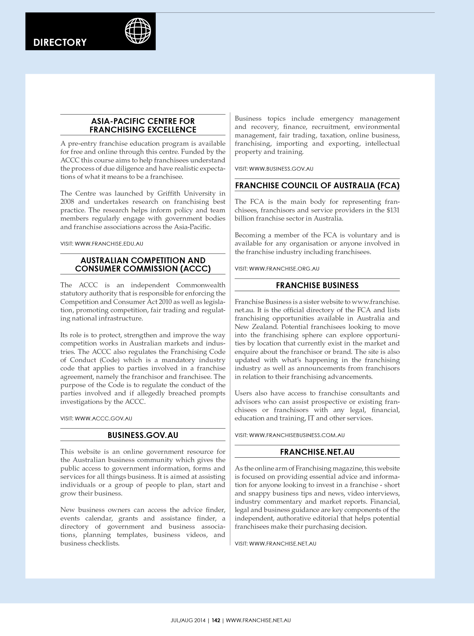
We also completely overhauled the back section just to be more clean, simple and professional, whilst not giving it too much extra importance.

You may also like

Beastwear TV Commercial
BrandingCinematographyCreative Direction
Australian Doctor - Mental Health Infographic
Graphic DesignIllustrationPrint Design
Lenovo - Startup Daily Banners
Graphic DesignWeb Design
Franchising Magazine JAN/FEB 2014
Print Design
Kirrawee High Jersey 2015
PhotographyTextile Design
Australian Doctor - Drug & Alcohol Infographic
Graphic DesignIllustration
Women in Hospitality
Editorial DesignGraphic Design
Dandenong All Abilities - Basketball Uniforms
FashionTextile Design
Money Management 18 AUG 2016
Art DirectionGraphic DesignEditorial Design
Desk Prank - Reversed
CraftsInterior Design
Back to Top